‘How do I select a Web Layout Design Technology, for my website?’
‘What is the difference between Fluid, Adaptive and Responsive Web Layout Design Technology?’

Differentiating between fluid, adaptive and responsive design technology is difficult. Clients ask to know about the differences in these technologies. This post helps clear confusions by shedding light on in-trend technologies that we use to create web solutions having high-end customized user experience irrespective of the device used.
Overview of the technologies discussed in this blog:
- Fixed Layout websitesA layout designed with fixed measurements irrespective of factors such as the dimension of the browser window, font size or dimension of images. The size of websites developed using this strategy will not vary due to change in the size of the browsing window nor the screen size of the device.
- Adaptive Layout websitessions of common devices.
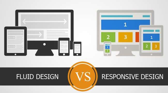
- Fluid Layout websitesElements on the layout with a fluid or liquid design make use of percentages to adjust themselves to the viewing area of the users screen automatically. As a result, columns re-size themselves relative to each other, and elements on the page scale up and down fluidly to adjust to the browser or screen.
- Responsive Layout websitesThis design strategy makes use of fluid grids that change with the browser. They auto arrange the content breaking apart and realigning elements to fit the screen resolution.
Steering away from the ‘Fixed layouts’ approach, towards a ‘Fluid’, ‘Adaptive’ and ’Responsive’ approach ensures that your websites offer an enhanced user experience. We will not discuss ‘Fixed layouts’ any further.‘Fluid’, ‘Adaptive’ and ’Responsive’ layout designs share one common feature. All three adjust the layout to the size of the screen irrespective of size and provide a richer user experience.Deciding which design approach to go with depends on the elements that you need to show on the layout of the website. Hence, website owners and their designers should understand the specifications of their website and the domain that it will cater to, before they can decide which approach to go with.
Here is how you choose a Layout Design Approach based on the type/nature of your website
Fluid Layout Designs work best for websites that have lot of text content and limited graphic and programming elements, like Blogs, Forums, Information websites, etc. Alignment of text on their pages can scale and adjust to different screen sizes easily.
On the other hand, website that have complex or multiple programming and graphical elements are not so easily scalable; eCommerce, Services, Catalogs or Gallery websites, need something more specific and tailor made to help them adjust to different screen sizes. Hence, Adaptive and Responsive Layout design are suitable for such websites.
You could also choose the best Layout Design Approach for your website, by weighing the pros and cons of each approach
| Pros: | Cons: | |
| Fluid Layout Design | – More flexible than static layouts – Allows for a good user experience on desktop computers |
– Does not cater to smaller devices like mobiles and tablet, or larger screens such as iMac’s – Can result in inconsistent content – Large images can cause the layout not to resize efficiently |
| Adaptive Layout Design | – Provides good user experience on multiple devices – you can manage a single website across different devices – Designs are tailor made for each specific device |
– Takes more time to implement as many elements are duplicated to fit each specific device – Developing layouts for every possible device is not possible, and niche devices with unique screen resolutions may get overlooked |
| Responsive Layout Design | – Optimal user experience on all devices – Future proof and easily manageable |
– Pre-development phase requires more preparations and thoughts to proceed – Requires more time to implement |
Our Opinion
In our opinion, Responsive Web Design is the most efficient of the three approaches, as it combines the benefits of both fluid and adaptive design.
The content adjusts to fix the resolution of the screen. On larger screens, layouts would spread out to occupy all the space available, whereas on smaller screens layout elements would rearrange themselves to show properly on the screen. This means that you do not need to have multiple tailor layouts for every different screen size that exists, instead the programming for the layout determines the size of the screen and its resolution and then resizes and reorganizes elements on the layout so that they display properly.
Are you interested in knowing more about latest technologies, designing and developing trends, or in receiving statistics and comparisons? Leave your comments and suggestions for the next topic you would like to read about and we will post information for that.
